![]() �
�
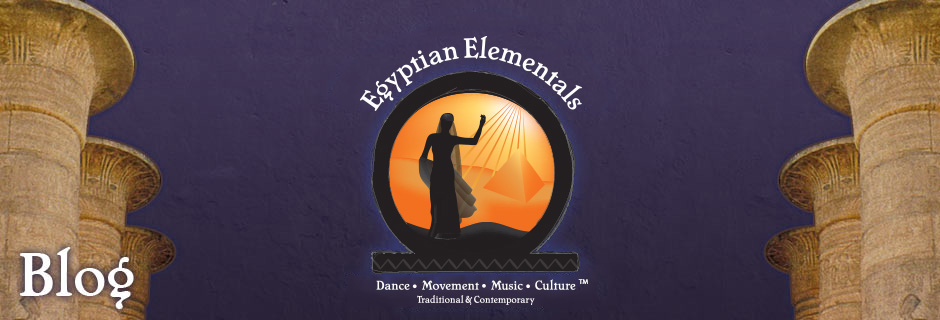
Excerpt����.The juxtaposition of Deshret (the red desert) with Kamet (the black land) hints at the strong dichotomy that exists throughout Egypt. The juxtaposition of the bold geometric shapes with the Islamic Architecture and the fluid arabesque shapes of theCalligraphy, � water/desert; ; modern/ancient; tension/release; green/red; chaos/stillness; contemporary and traditional ideas do � inexplicably � sit side by side in wonderous harmony.
This theme of opposites is also reflected in the dance itself � a constant quest for balance and harmony through the expression of male and female energies.
I experienced this preternatural energy throughout Egypt � but particularly when traveling on, or when by the Nile in the South. There is an almost tangible sense of timeless balance and harmony between the female/male energies � a warm and wondrous envelopment, a strong impression of a great nurturing beauty and potent natural wonder. This sense of male/female accord that spans time and creation serves as an inspiration to what can be achieved when strengths are realised, rather than weaknesses exploited. �
Excerpt taken from �About the Logo� by Juliet Le Page on the Egyptian Elementals Dance website
Much appreciated for the information and share!
Great blog! Is your theme custom made or did you download it from somewhere? A theme like yours with a few simple tweeks would really make my blog jump out. Please let me know where you got your theme. Thank you
Hi Benjamin,
The theme and the logo are all part of the Trademark of �Egyptian Elementals Dance� The Dance, History and Culture of Egypt�. It comes from my Website http://www.eed.com.au which I designed and coloured first on paper, � the design was then realized by my webmaster. If you want something that resonates I would suggest using your own creativity � sit and contemplate the purpose of your web presence and then imagine how you want to evoke that purpose through the visual. It is a lot of fun to do!!
Giter says:
November 6, 2011 at 7:18 am
Often on sundays don�t have much to do and not after 7 in the morning , thus I�m surfing through the net. I�m interested in websites made with wordpress , mainly the design. Nice graphics!
Not so bad. Interesting things here
Thank you for the good writeup
Youre so cool! I haven’t read anything like this before. So good to find an individual with some original thoughts on this subject. really thank you for starting this up. The internet needs somebody with a bit of originality. Kudos for bringing something new to the internet!
Some truly nice, utilitarian info on this web site, as well the design and style has fantastic features.
Absolutely Great! The content is very informative and educational. I�ve learned a lot of ideas through this stuff. Thank you!
Awesome blog! Where did you get that awesome design?
I drop a comment each time I appreciate a post on a blog or I have something to contribute to the conversation.
Usually it’s caused by the passion communicated in the post I browsed. And after this post A word about the Logo | Egyptian Elementals Dance Blog. I was excited enough to post a comment 😉 I do have 2 questions for you if it’s alright. Could it be simply me or does it look like like some of the responses read
as if they are coming from brain dead people? 😛 And, if you are posting at other online sites, I
would like to follow you. Could you list the complete urls of all your communal sites like your linkedin profile, Facebook page or twitter feed?
I am genuinely happy to read these blog posts which include tons of helpful facts, thanks for providing the information.
Thanks foг ѕharing your info.
I truly appreciate your effоrts and I аm ωaitіng for youг further
write ups thank yоu οnce again.
Have been observing for sometime how much you influence the Belly/Middle Eastern dance scene in Australia – you do it…they do it. About time some of these so called ‘experts’ acknowledged you and showed some appreciation for your dedication and work.
I love reading through an article that can make men and women think.
Also, thank you for allowing for me to comment!
Thanks for ones marvelous posting! I truly enjoyed reading it, you happen to be a great author.I
will ensure that I bookmark your blog and will come back down the road.
I want to encourage yourself to continue your great
job, have a nice holiday weekend!
Right here is the right website for anybody who wishes to understand this topic.
You realize so much its almost tough to argue with you (not that I actually would want to�HaHa).
You certainly put a new spin on a subject that has been written about for years.
Excellent stuff, just excellent!
Very nice post. I simply stumbled upon your weblog and wished to say that I have truly enjoyed
surfing around your blog posts. After all I’ll be subscribing in your feed and I am hoping you write once more very
soon!
I’d like to thank you for the efforts you’ve put in writing this website.
I really hope to view the same high-grade content
by you in the future as well. In truth, your creative writing abilities has inspired me to get my very own site now 😉
I am really impressed with your writing skills and also with the layout on your blog.
Is this a paid theme or did you modify it yourself? Either way keep up
the excellent quality writing, it is rare to see a nice blog like this one nowadays.
Thanks for the marvelous posting! I really enjoyed reading it, you happen to be a great author.I
will ensure that I bookmark your blog and may come back in the
future. I want to encourage you to ultimately continue your great writing, have a nice afternoon!
whoah this weblog is wonderful i love studying your posts.
Keep up the good work! You realize, many individuals are looking around for
this information, you could aid them greatly.
Keep this going please, great job!
This website was… how do I say it? Relevant!! Finally I’ve found something that helped
me. Thanks a lot!
bookmarked!!, I love your web site!